Project: Individual Class Project
Role: Product Designer
Timeline: Jan - Mar 2025
Tools: Figma, Miro, Google Docs
Background
In my two years of living on campus, I have encountered the recurring problem that Ann Arbor lacks a reliable and efficient method for selling and buying second-hand items. Through conversations with fellow University of Michigan students, I found that this was not an individual struggle.
I was eager to learn more about the common challenge of finding a reliable and convenient way to buy, sell, and trade goods within the local community.
Goal
I aimed to design a seamless and user-friendly marketplace tailored to the needs of students and residents. The goal was to create a platform that prioritizes trust, security, and efficiency—making it easier for users to exchange items without the common frustrations of traditional marketplaces.
Problem Statement
U-M undergraduate students need a safe, efficient, and reliable way to buy and sell second-hand items, allowing them to declutter their belongings while earning extra money without the risks and frustrations of existing marketplaces.
User Research
To identify the needs of U-M students and Ann Arbor residents, I conducted user interviews to gain deeper insights into their experiences with buying and selling second-hand items. My goal was to identify key pain points, preferences, and behaviors when using existing platforms like Facebook Marketplace, Snapchat Stories, and Reddit.
I conducted interviews with 4 U-M undergraduate students and 1 Ann Arbor resident for 30 - 45 minutes each.
Interview Questions
Examples of questions include...
1. Do you often feel the need to sell your belongings?
2. Do you often seek second-hand items?
3. If so, how do you search for + purchase items?
4. What is your biggest concern when moving out of campus living situations?
5. How do you deal with clothes that you don’t need anymore? Items such as textbooks, furniture, and other items?
6. Are you a user of Depop? Why or why not?
Insights
1. Safety Concerns & Accessibility
Students worry about the safety of buying and selling second-hand items, particularly on platforms with unknown or unverified users.
Many students do not have a car, making it difficult to meet buyers or move larger items like furniture.
2. Lack of Awareness & Intimidation with Existing Platforms
Some students are unfamiliar with second-hand selling apps and marketplaces, leading to hesitation in using them.
Others find platforms like Facebook Marketplace more appealing because they feel items are fairly priced and widely available.
Depop, in contrast, is viewed as overpriced and driven by profit rather than necessity.
3. Storage & Organization Struggles
Many students hold onto unwanted items (such as clothes, furniture, and textbooks) until they become overwhelming, often relying on parents to eventually donate them.
The transition between leases is a major issue—students are unsure what to do with their belongings when moving between housing situations.
4. Cost Efficiency is a Key Factor
Students actively seek second-hand options for expensive items like textbooks, furniture, and technology.
They prefer platforms where they can find fair prices rather than feeling like they’re overpaying for used goods.
These insights highlight the need for a trusted, student-friendly second-hand marketplace that prioritizes safety, affordability, and ease of access, while also providing solutions for storage and transportation challenges.
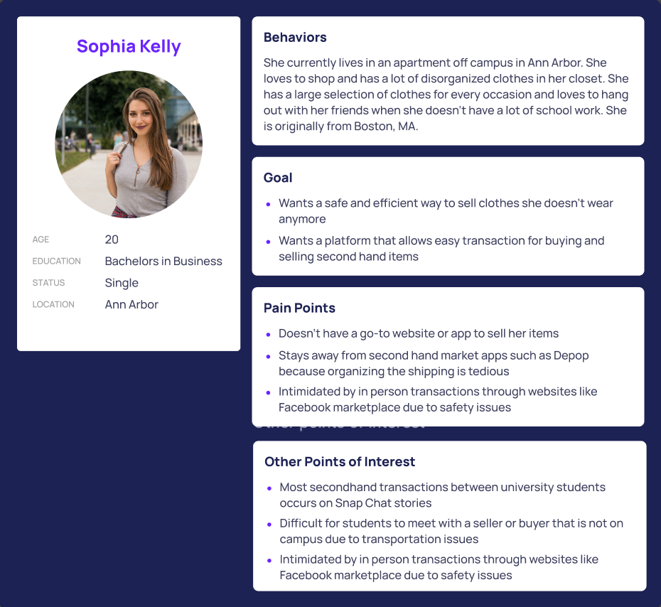
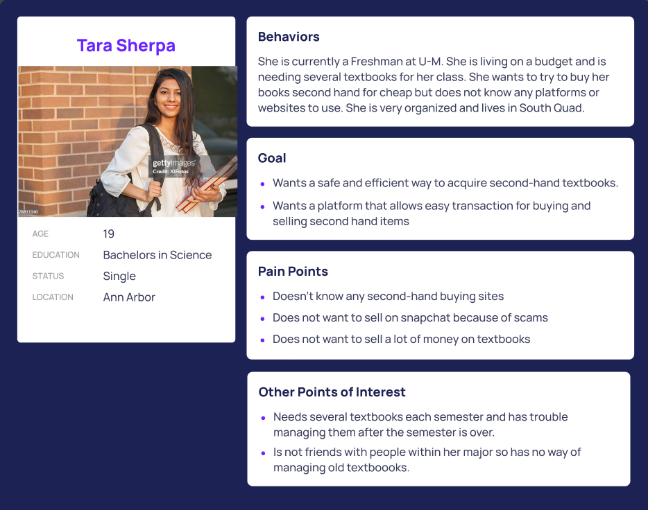
User Personas
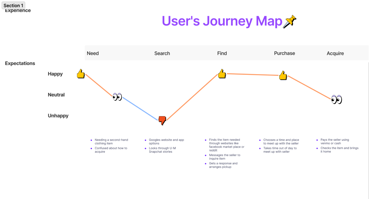
User Journey Map
Ideation
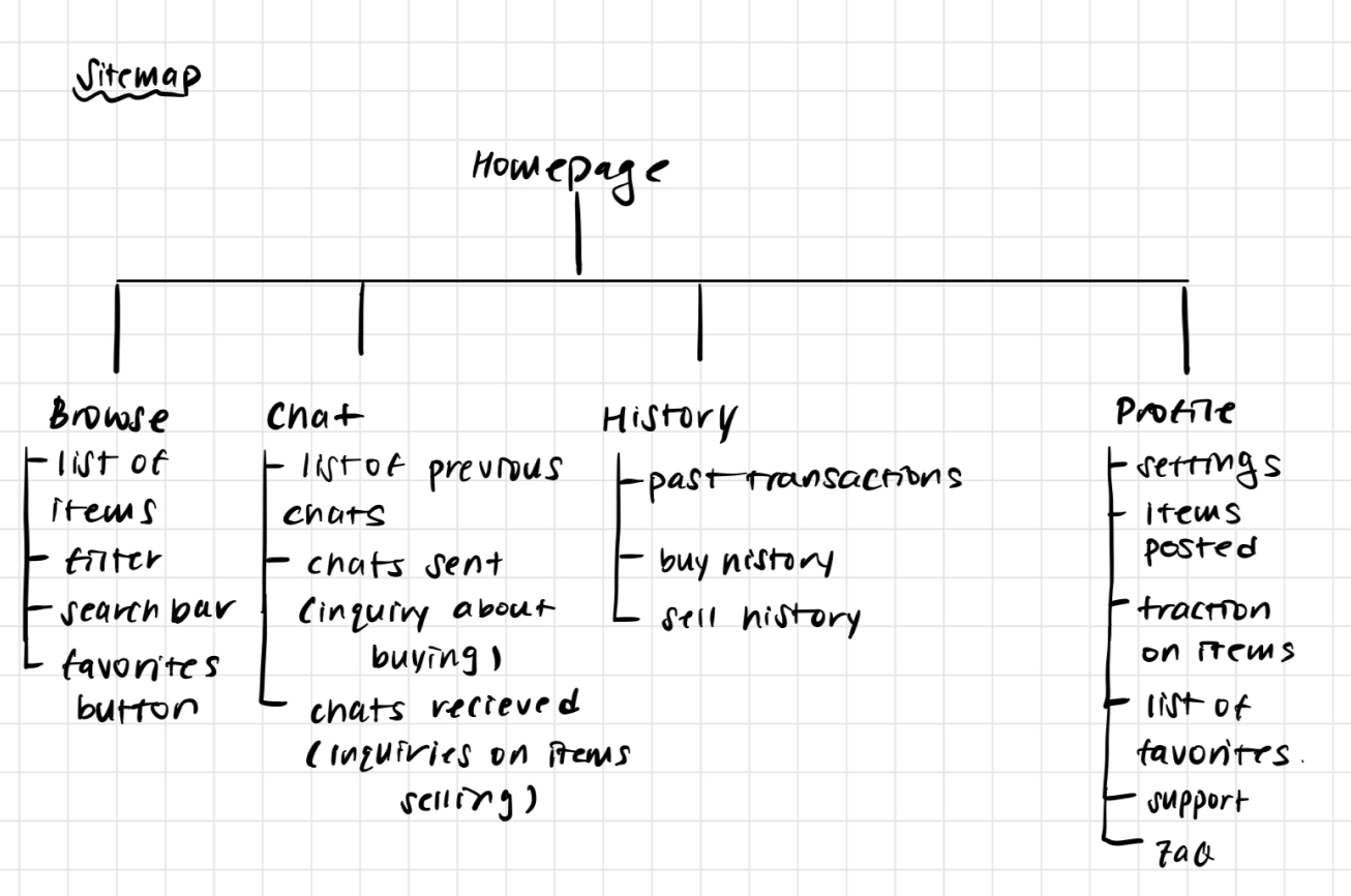
Sitemap
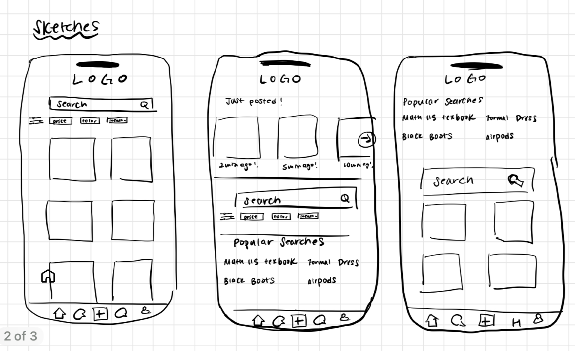
Low-Fidelity Sketches
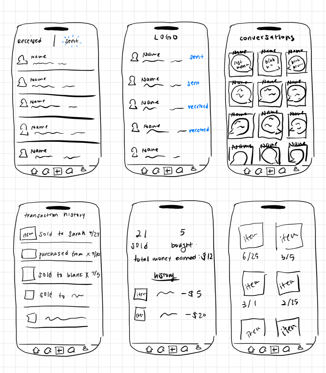
Low - Fidelity Wireframes
Design Guidelines
Feedback and Iteration
After developing the initial designs, I conducted user testing to gather feedback on usability, functionality, and overall experience.
Through testing sessions and feedback surveys, I collected insights...
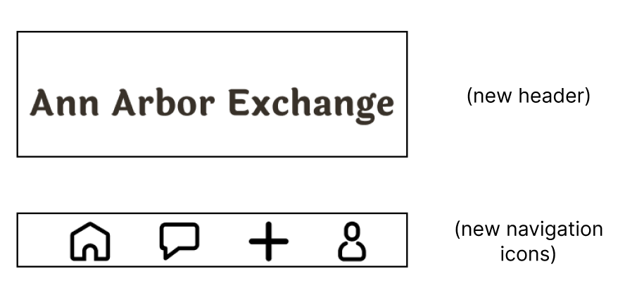
Feedback: The purple and dark brown for the header and footer need to be adjusted for more contrast and better readability. (classmate)
Iteration: I pivoted to a minimalistic approach as I changed my background color for the header and footer to white instead of the original brown.
Iteration: I pivoted to a minimalistic approach as I changed my background color for the header and footer to white instead of the original brown.
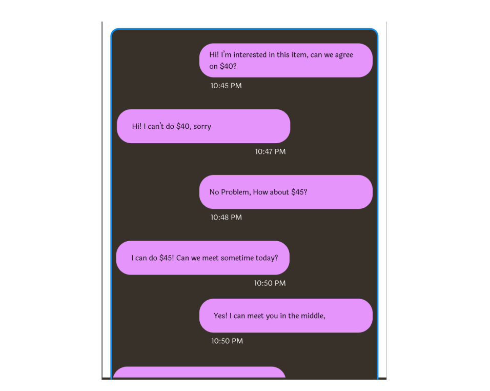
Feedback: The chat UI (timestamps under the message bubbles) needs improved clarity. (Instructor)
Iteration: The feedback brought to my attention how important it was to space out and design smaller details like timestamps and how much it can change a user’s experience with the app. I decided to make it a white color instead of the original pink because it would pop out more compared to the brown background. I also adjusted the placement of the timestamps to make it closer to the chat box it is associated with.
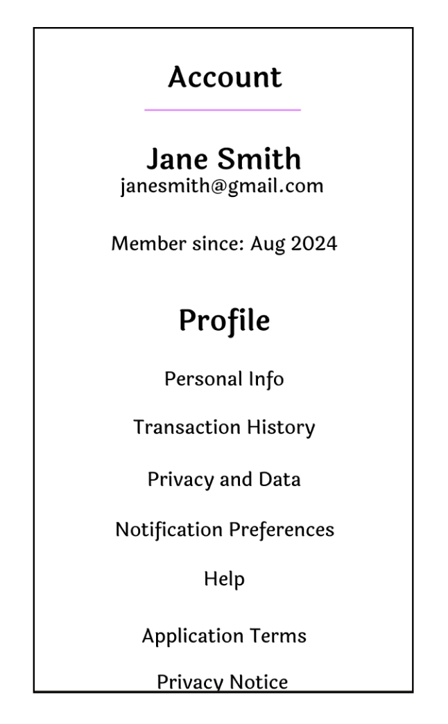
Feedback: The account page should have a better hierarchy of information. (Joseph)
Iteration: The simple list of categories made it difficult to try to find the category that the information the user is looking for is placed in. I made the most important information, such as the profile’s name and associated email address, the biggest and top part of the page. The next piece of information that I thought was important was the durance of the membership. Then, I created a separate profile section to organize the subsections.
Iteration: The simple list of categories made it difficult to try to find the category that the information the user is looking for is placed in. I made the most important information, such as the profile’s name and associated email address, the biggest and top part of the page. The next piece of information that I thought was important was the durance of the membership. Then, I created a separate profile section to organize the subsections.
Final Design
Takeaways
1. Prioritizing Convenience & Accessibility
Many students struggle with transportation, making it essential to integrate features like on-campus pickup spots or peer-to-peer delivery options to facilitate exchanges.
A simple, streamlined listing process encourages more students to sell their items without feeling intimidated.
2. Building Trust & Safety
Safety concerns are a major barrier, so incorporating verified student profiles, rating systems, and secure payment options can help users feel more confident in transactions.
Clear communication tools within the platform (e.g., in-app messaging) can reduce the risks of miscommunication and scams.
3. User-centered design
By following the user research process, I gained firsthand insights into students’ pain points and behaviors.
Iterative testing and feedback helped refine the platform to better meet user needs, reinforcing the importance of designing with, rather than for, the users.