Project: Team Consulting Project
Role: Consultant
Timeline: Feb - May 2024
Tools: Squarespace
Brief
My project team, through Reach Consulting Group, took on a project to redesign the Wyoming Children's Trust Fund (WCTF)'s website.
Through communicating with our clients and identifying the problems with the original website, we aimed to create a mockup of a design layout that would bring better traffic to the website.
The Community
Because the WCTF website provides information about abuse prevention, the main user group is looking for resources and may be in urgent, attention-seeking situations. This could be a younger age group, such as children, as child abuse is a focus of the website.
The website needed a solution to implement an intuitive, easy-to-navigate layout to account for the population of younger users and their purpose of looking for resources while in a vulnerable situation.
Problems
While exploring the website, the biggest problem was the user flow. From a user's perspective, the pages were difficult to navigate as the information did not follow a logical order.
The second biggest area of improvement was the long list of PDF files. The cluttered list of PDF files increased the scroll time while looking for useful information.
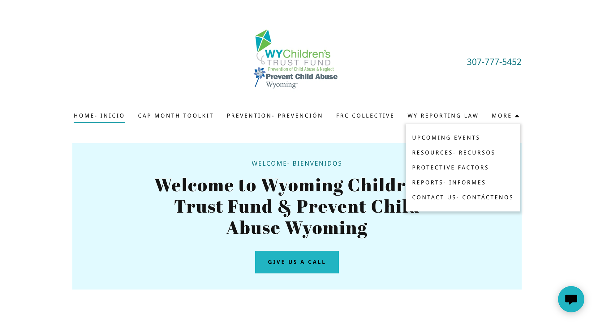
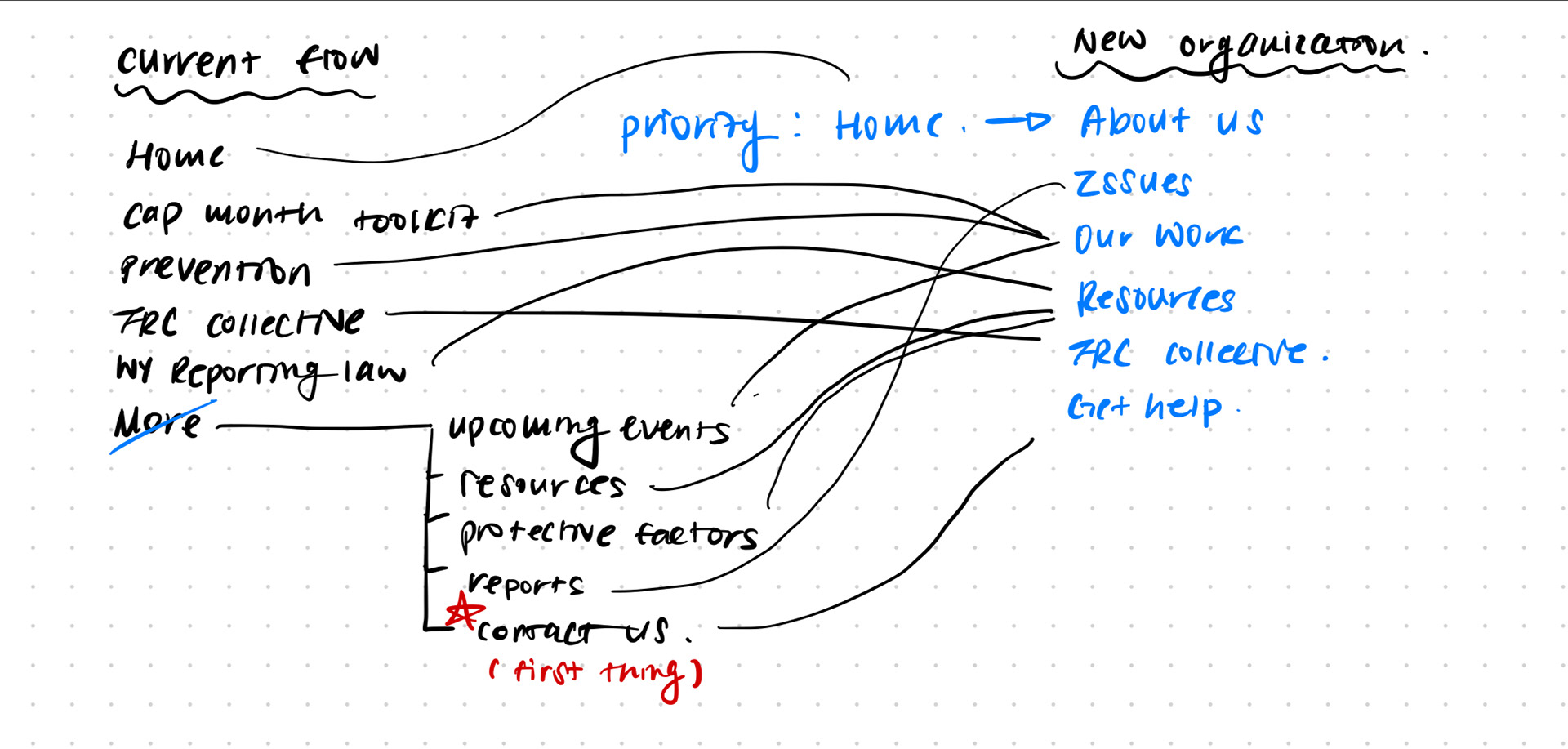
Navigation
The page navigation titles are not intuitive. "Prevention" and "WY reporting Law" do not give the user a clear idea of what kind of information they would find on these pages. Titles being stored under "more" causes users to need to search longer to find the information they are looking for.
While only 4.71% of Wyoming residents use Spanish as their primary language, every page title included a Spanish translation. The double descriptions lack consistency as well. The longer titles take away from the emphasis.
Mission Statement
The user would have to do some clicking around to find the mission statement under "prevention". Once again, the double-lining of Spanish translations takes away from a clear message to the user.
The subtitle that follows, "community-based child abuse prevention" is ambiguous as users might question how it relates to the mission statement.
A long list of PDF images about various topics follows though it is unclear how they are related to other information on the page.
Reports
The user would expect the "Reports" page to provide information on statistical data about child abuse and prevention efforts from WCTF.
However, the original website once again shows a long list of PDFs, some unrelated to reports.
Contact
The arguably most important page of the website does not provide contact information in a straightforward method. Though users may be looking for an urgent way of getting in contact with authority the page starts with listing the leadership of the organization.
To better accommodate users, the contact form could be shown on the front of the page.
Our Goal
Reduce the time and effort it takes to locate a resource or get help.
Research
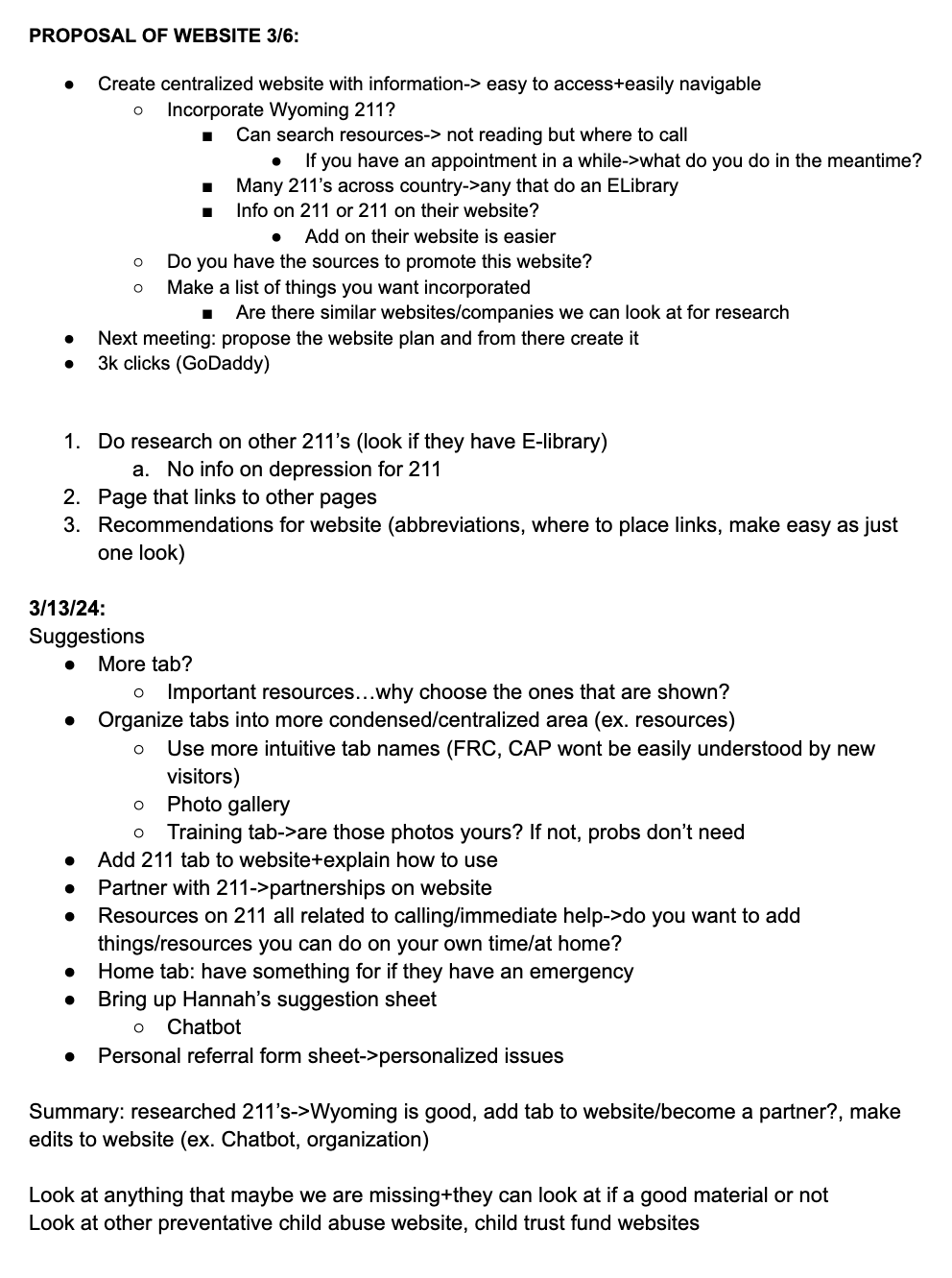
Client meeting notes/proposal for deliverable
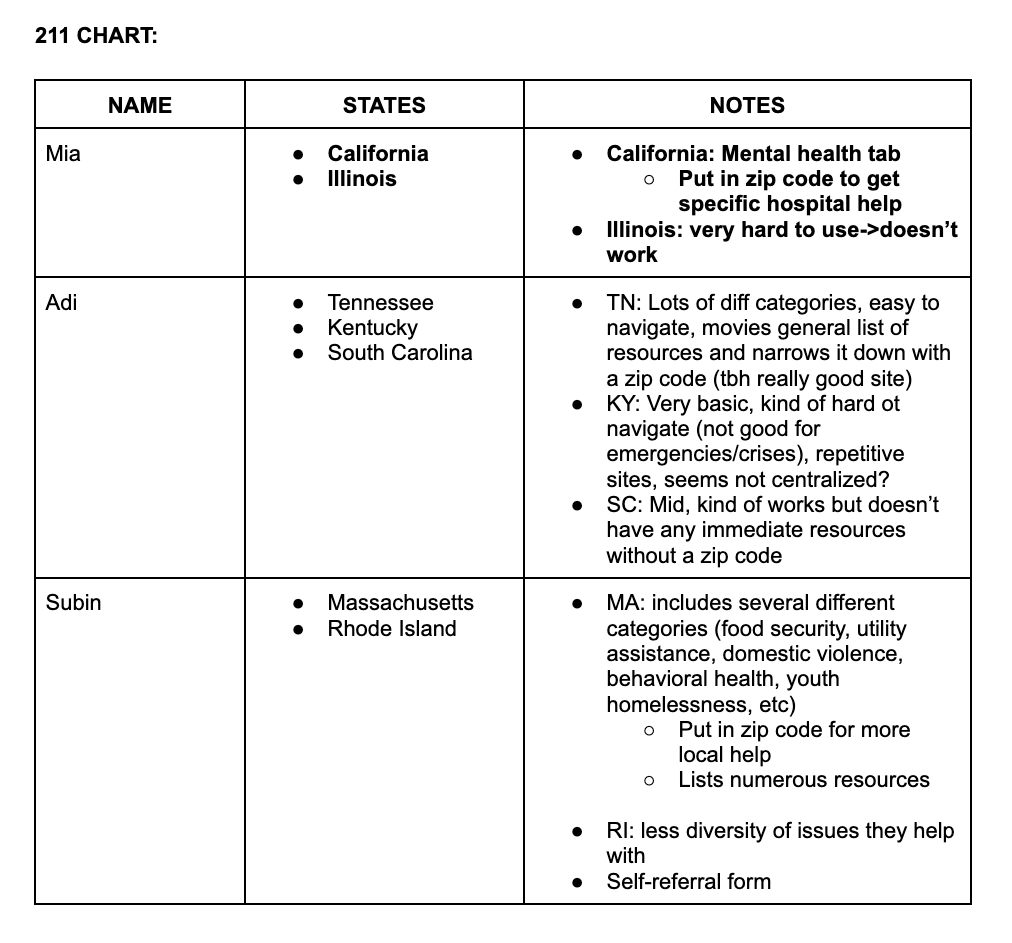
Notes on other 211 state website organizations
Ideation
Ideation explorations for navigation page user flow

Ideation for Home page organization
Our Solution
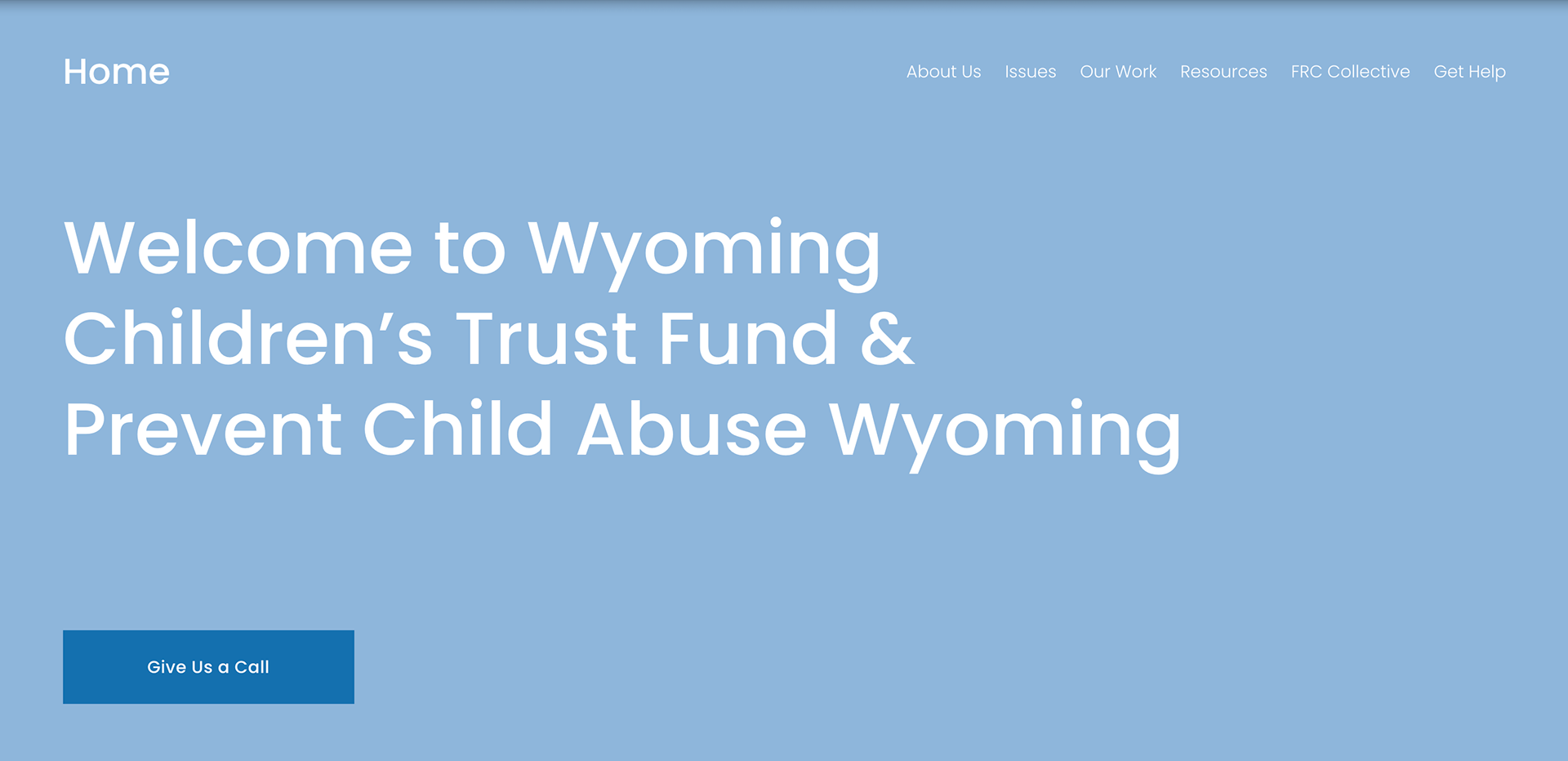
Homepage
The new homepage takes on a simpler style that incorporates the purpose and mission of WCTF.
The number of navigation pages is condensed to 6 compared to the original 10.
The call button is easily accessible as it is one of the first things a user would see.
The donate button is moved to the footer so that it is accessible from all pages throughout the website. The contact information in the footer provides an intuitive location to connect with WCTF.
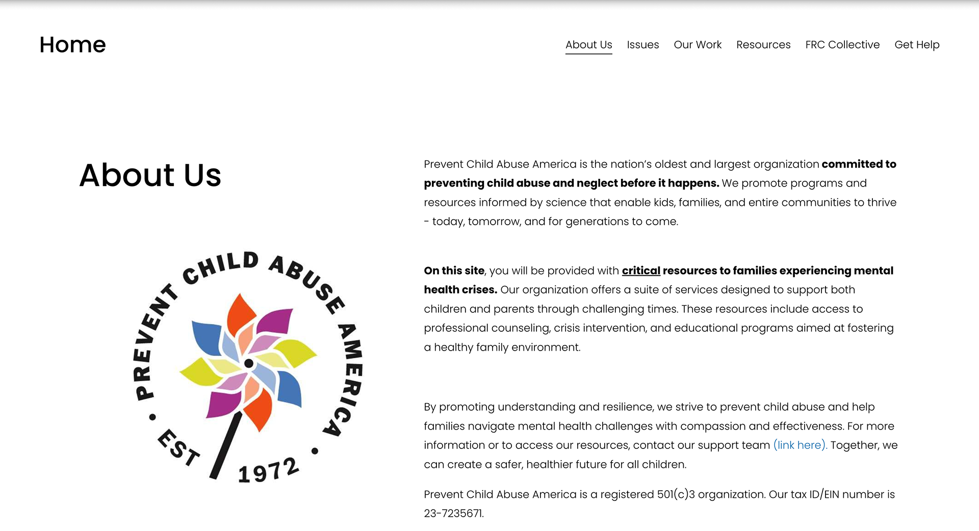
About Us
By creating an "About Us" page in the navigation, we aimed to deliver an overview and purpose of WCTF without overwhelming the home page.
Eliminating the Spanish translation that followed every line creates more focus on the main message of the paragraph.
Bolding and underlining also help grasp the user's attention on crucial points.
Issues
The "Issues" page creates a place where WCTF can express their main problems of interest as well as their specific advocacy efforts.
Reducing the number of PDF files shown on a page focuses users' attention on the most more important and related aspects of WCTF in child abuse prevention.
Our Work
"Our Work" creates a broader category to store multiple previous pages such as "prevention" and "reports".
By utilizing a streamlined flow, the training interest form is located in a more predictive order for users who are looking to join WCTF.
The "Learn More" button leads to an extended list of reports, PDF infographics, and key government documents that are not directly related to WCTF. This could be an area for further organization and UI/UX development.
Resources
The new "Resources" section centralizes the previously scattered information about where to seek help for abuse.
This page emphasizes WCTF's collaboration with Wyoming 211 as well as redirecting users to find more localized resources.
Takeaways
This was my first project working with a client and using UX to problem-solve. This project was especially meaningful to me because it dealt with the heavy topic of child abuse prevention and how to make information and resources more available to those seeking help.
My most important takeaways were...
Communication
Working on a client-based project, I learned to work side-by-side with the client's requests. Feedback loops were crucial to ensure we were creating a product that satisfied the client's request.
User-Centered Design
Throughout redesigning, I fully immersed myself in the perspective of the user navigating the website. This emphasized the navigation pages and how information could be better organized across several subpages. Taking on a concise, easy-to-read, and consistent approach proved to be the most successful in creating headings.
Streamlined User Flow
My team focused on intuitive navigation and a streamlined flow throughout redesigning. Identifying the pain points of the original website and simplifying the steps to navigate pages allowed us to follow a logical order of steps to familiarize users with the user experience.